How do you want your business to be viewed? Are you looking to create an image of professionalism and reliability? Or are you hoping to create an image of fun and carefree living? A logo can play a major role in conveying this image, but what type of logo design will most effectively get your point across? Read on to find out about the six types of logo designs that are sure to make your business stand out from the crowd.

1) Lettermarks

Lettermarks are an extremely popular design these days. Lettermarks are used to identify a brand and make it recognizable among competitors. The lettermark style is an effective way to personalize your business because lettermarks can be individualized to reflect a brand’s personality and values. Some famous businesses that use lettermarks include Nike, NBC, H&R Block, BP Oil, and PayPal. If you want your company to stand out from its competition, then you should consider creating a unique logo. One benefit of lettermarks is that they can easily become part of other forms of branding, such as advertising and marketing materials. DAN LIPPMAN is the best example of this type of logo design.
2) Monograms
One of the oldest and most recognizable logo designs is also one of its simplest. The word monogram refers to any design composed of two or more letters, but it’s most commonly used in reference to companies that use their initials—the ABCs, 123s, and 887s of business. Some companies choose to display a single letter (as many colleges do), while others choose an acronym or a combination of both. Whatever you decide, make sure your brand identity design stands out from all your competitors by choosing a unique font for your logo. If you have trouble deciding on just one style, try using different fonts for each letter: You can always change them later if you want to go with something completely different!
3) Wordmarks

Wordmarks, or logotypes, as they’re sometimes referred to, are just what they sound like: a combination of letters that form a logo. Most wordmarks are created using an elegant font (like Helvetica) with an underline—this will be your trademark. While many types of logos exist, there is often confusion about whether a particular design fits into one category or another. Use these guidelines to find out what kind of logo you need for your business.
4) Abstract Logos
Abstract logos are like fine art pieces that display shapes and concepts rather than words. Some abstract logos, such as Google’s logo, can be difficult to interpret for people who don’t know much about the company or industry. However, if your business doesn’t need to clearly state what it does in a logo design, then an abstract logo could fit in well with your brand identity design.
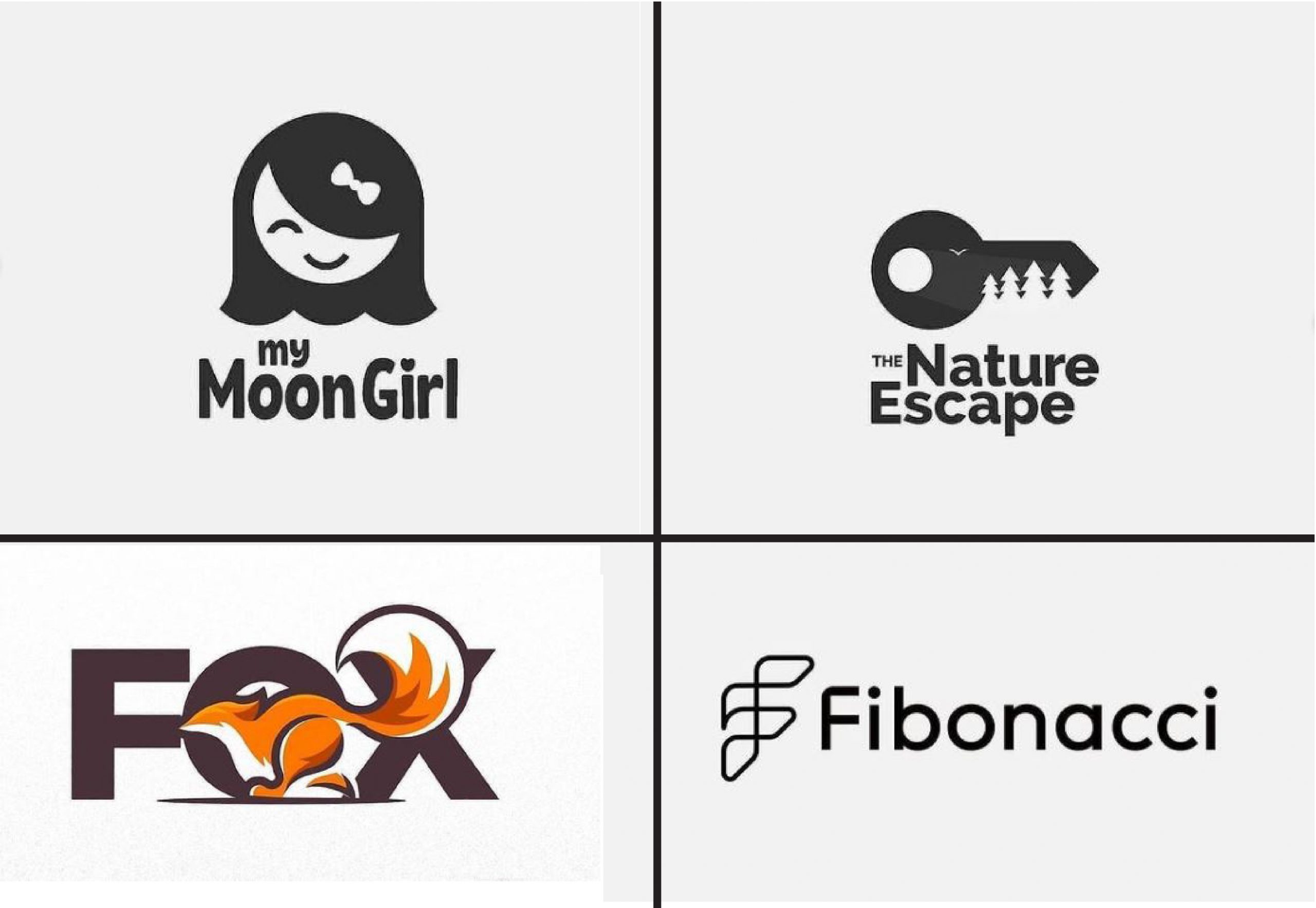
5) Simple Logos
Simplicity is timeless and effective for conveying your message to potential customers. Simple logos are characterized by a single graphic element, one or two colors, and little to no text. Examples include Apple’s logo featuring an apple with a leaf as its graphic; Target’s red bullseye; and NBC’s peacock-feathered logo. A simple logo can be more memorable than a complex one since it relies on fewer elements to get its point across. And it may even have universal appeal—the world would still recognize Nike’s swoosh if only one color were used. If you want to create a memorable brand identity design that will stand out from competitors, consider using a simple logo design that features a single icon or image and has limited text.
6) Emblem logos
The word “emblem” has been around since 1577, and is a variant on imblem, which comes from Middle French and means something like a cipher. An emblem is a logo consisting of symbols or typography. Think swoosh. You can use color to imbue your emblems with meaning—some brands use red to signify energy, orange for creativity, green for integrity, and blue for wisdom. If you’re looking for inspiration, here are some examples of famous corporate emblems: Nike’s (swoosh), Apple’s (apple), Starbucks’ (mermaid) and Shell Oil Company’s (shell).